Lr.
Work
About
Contact
The Problem Statement
Solution Overview - Main Features


Research & Analysis
The goal for this project was to improve the user experience for both students and professionals. To get a better idea of what this looks like, we conducted a heuristic analysis of the Go Pursue app to gain a better understanding of different pain points that can be improved. Once the pain points were identified, we conducted competitive research to find how other apps have resolved these pain points.

Goals
From the heuristic evaluation and competitive research, we found several places where the app can improve. We listed these as critical (must fix), major (not necessary to fix, but would be nice), and minor (fix if time allows). We were basing our recommendations on the Jobs-to-be-Done framework of Go Pursue.

User Flow
Once we defined our list of recommendations, we got to work on reworking the user flow of the Go Pursue app. We identified 10 different user flows, and divided the tasks amongst ourselves evenly. I was tasked with reworking the user flow for the hamburger menu and the professional side. The biggest task was figuring out how to integrate our recommendations in the already-existing user flows without causing too much disruption to the original product.

Concepts and Wireframes
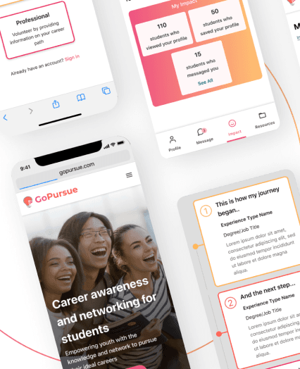
After getting the approval for our changes to the user flow, we started making wireframes with the screens they provided for us. Our Go Pursue contact mentioned how they would like to see some kind of career roadmap that students can see similar to something you see on Roadtrip Nation.
Here are the initial wireframes I designed based on what was requested.


From our low-fidelity testing, we learned that users found the new section to be redundant with the Education section. In addition, users were unsure of what to write in this section. One user suggested adding a prompt asking professionals to describe any challenges they faced while making important career decisions.
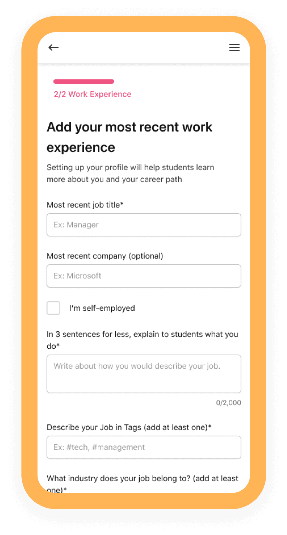
I updated the screens with user feedback.


Visual Design & Prototype
We used the Go Pursue style guide to make our high fidelity screens.
High Fidelity Designs
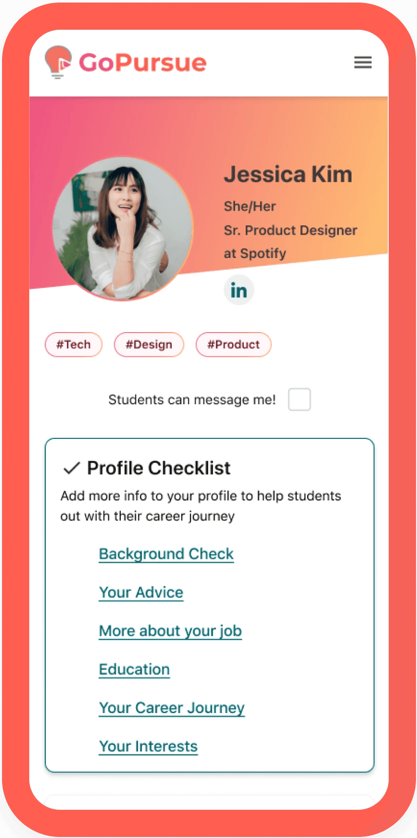
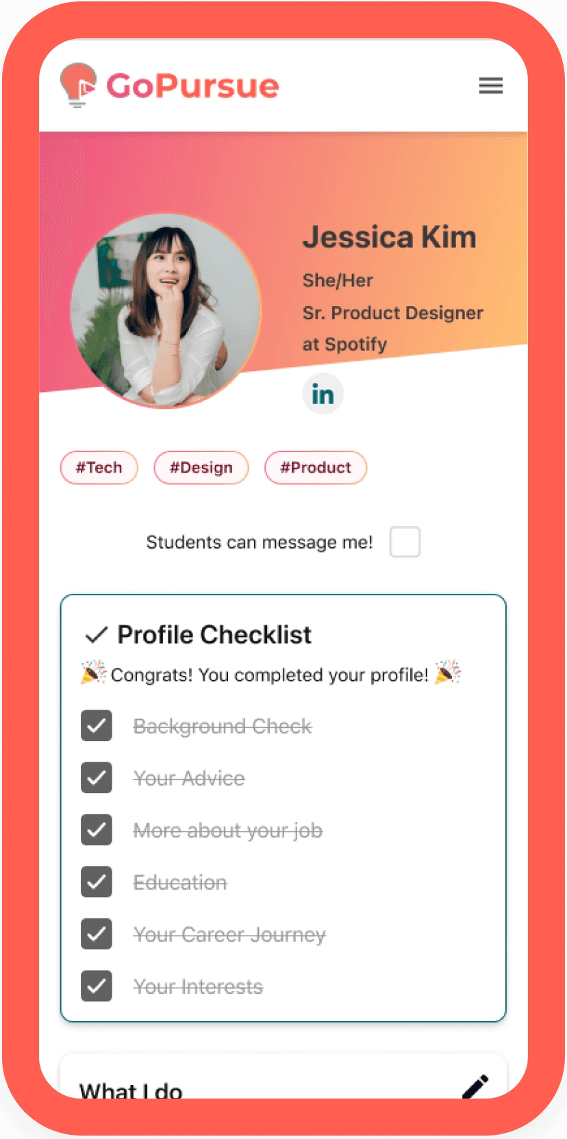
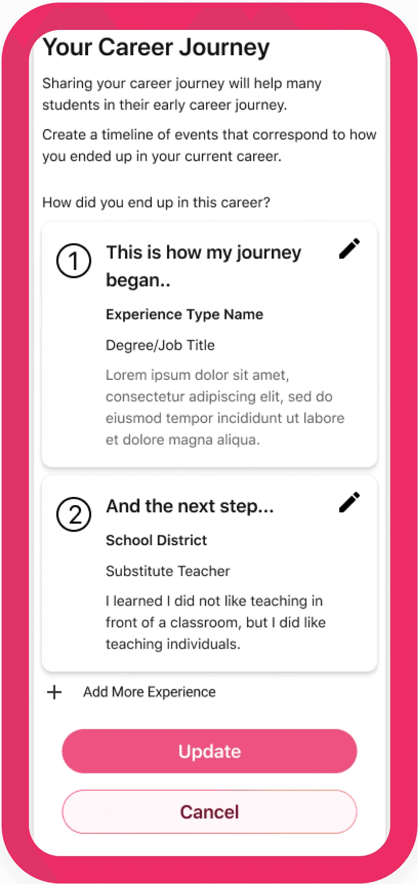
This is what the app looks like after putting the visuals into the basic wireframe.


Prototype

Test: Validation, Usability, Feedback
We took our changes into the real world for usability testing to see if our design changes met the stakeholder’s request and addressed the users’ needs that we learned in the research phase.
We conducted usability testing with 3 users, 2 who were professionals who had undergone a linear career path, and 1 who did not have a linear career path. These users were asked to gauge the ease-of-use of onboarding and completing the profile.
All users were able to complete the tasks without any help. There still seemed to be confusion on what users should write when it came to the My Career Journey section. We took the feedback from the users and integrated them in our final iteration of the app.
Original

Final

Challenges & Conclusion
Learnings
Conclusions and Next Steps
Linda Rieublandou ⏤ 2023