Novelette
Novelette is a webtoon reading app with an extensive library of webcomics of all genres.

The Problem Statement
Solution Overview - Main Features


Research & Analysis
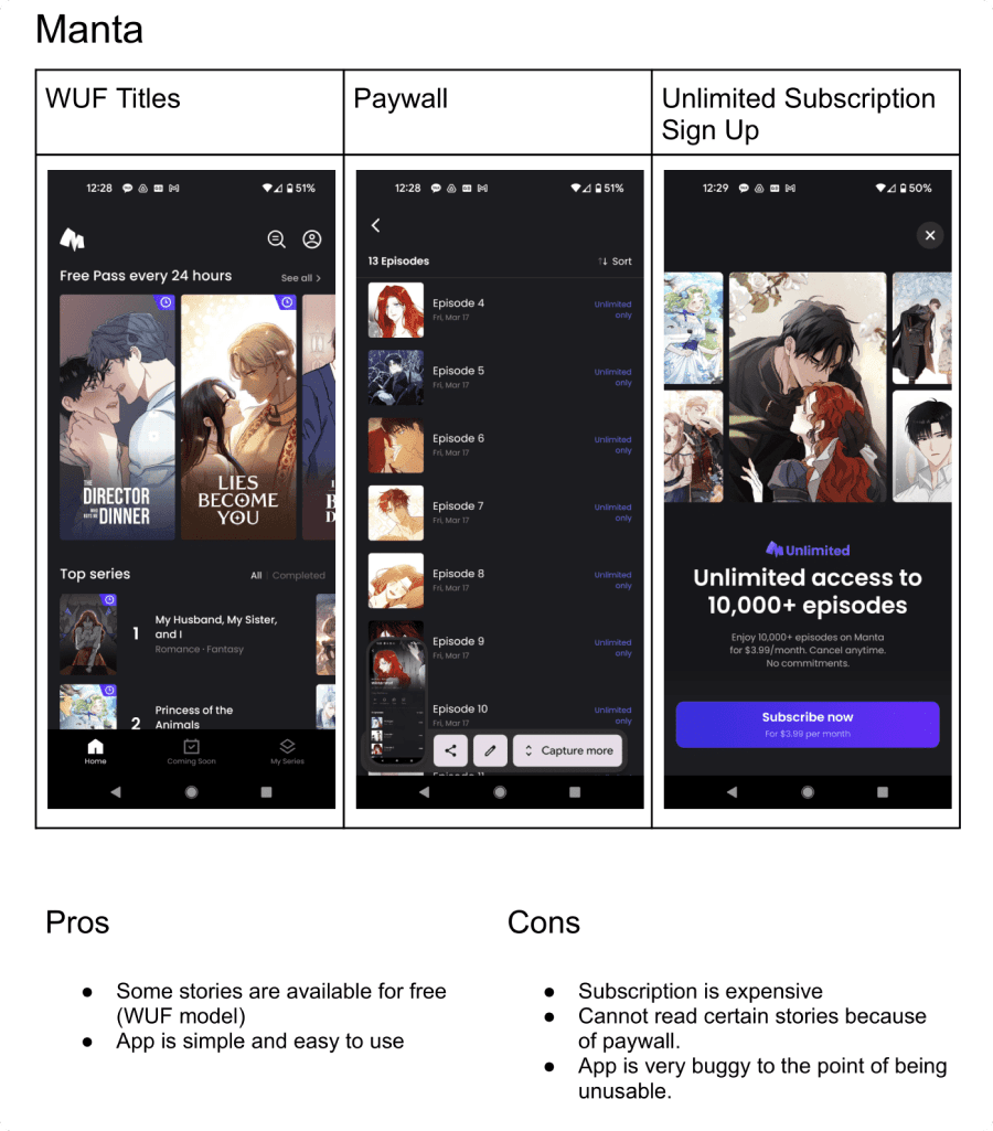
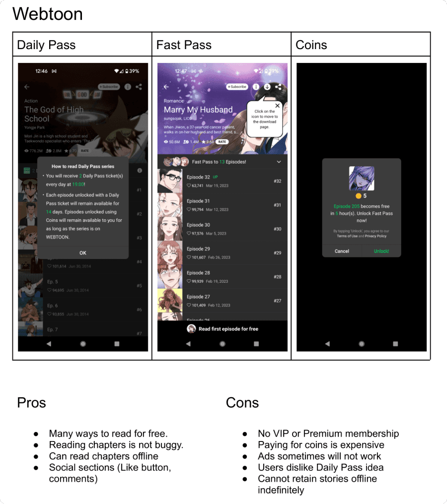
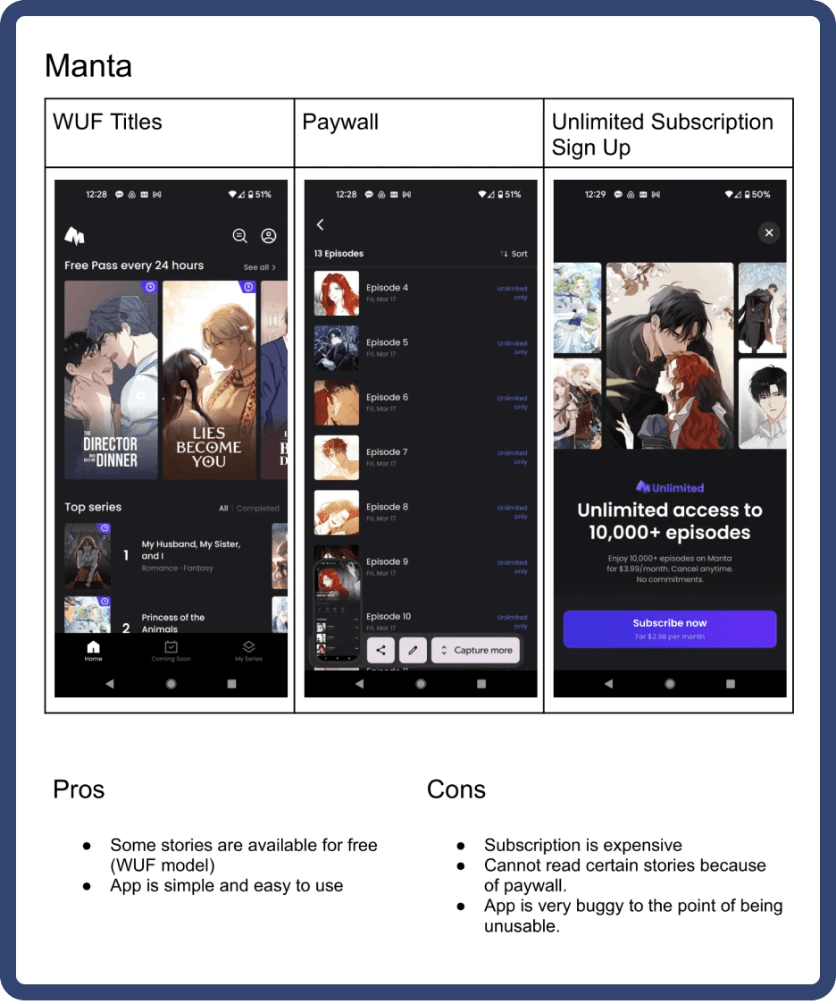
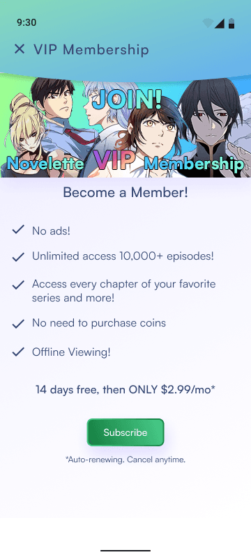
The goal for this project was to design an experience for free users to subscribe to a monthly service. To get a better idea of what this looks like, I conducted competitive research to gain a better understanding of what the experience looks like in successful models. I looked at 3 different webtoon apps: Webtoon, Shonen Jump, and Manta.
From studying the apps, I learned 2 things:
Users want a way to be able to read webcomics for free.
Users would pay for a monthly subscription fee only if it is affordable.


Goals
From reading user reviews on the Google Play Store, the biggest pain point seems to be the affordability of these apps. Here are some goals I had for this project:
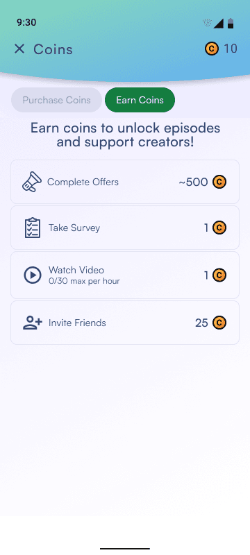
Provide a way for users to use the app for free
Provide a more convenient way to use the app through a paid subscription
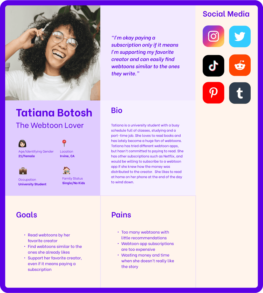
User Persona
To start answering the How Might We question, I identified the user base persona - The Webtoon Lover.
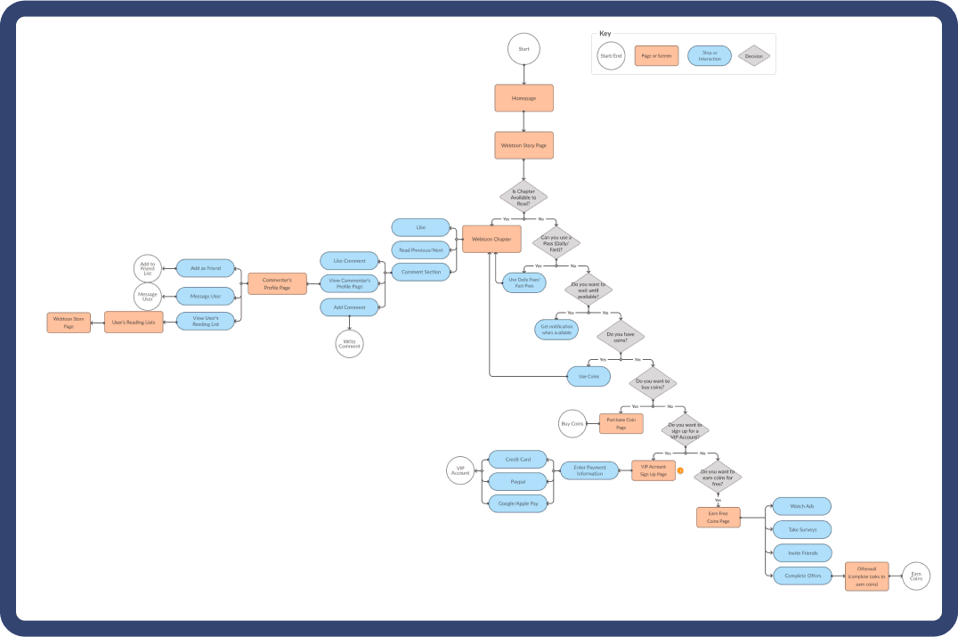
User Flow
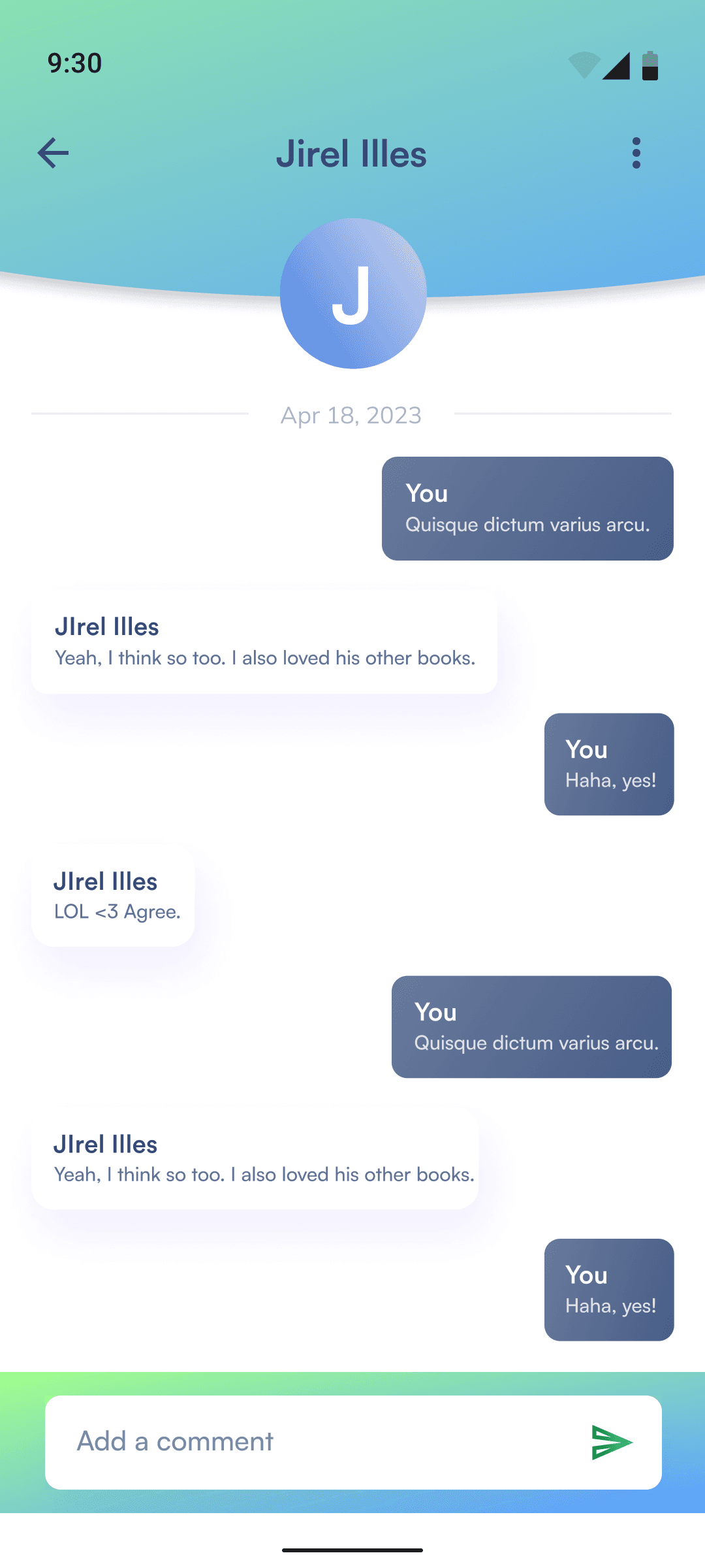
Once the users were defined, I started thinking about the user’s journey through the app. Designing user red routes helped to define which features were absolutely necessary, which helped to narrow down the minimum viable product (MVP).
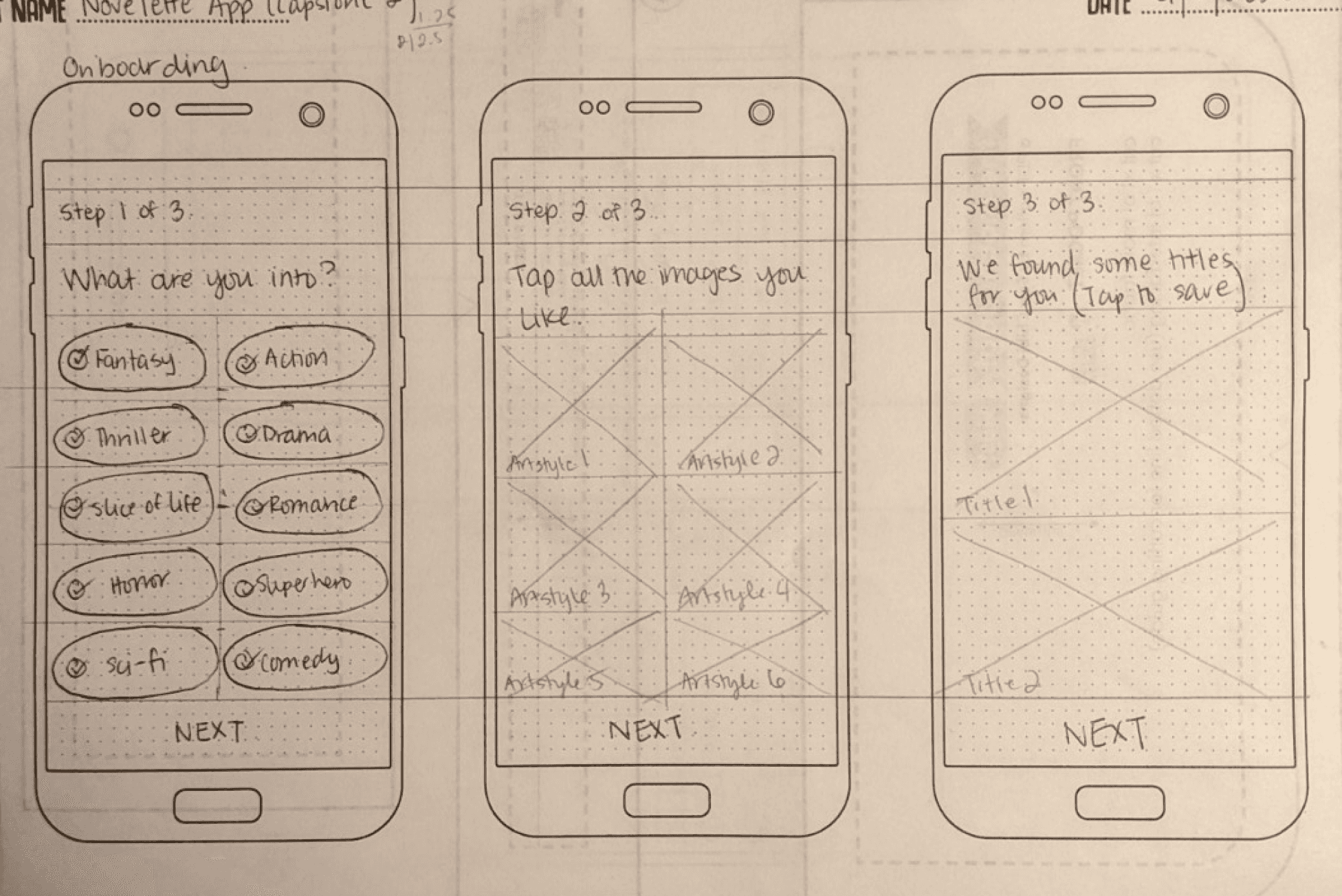
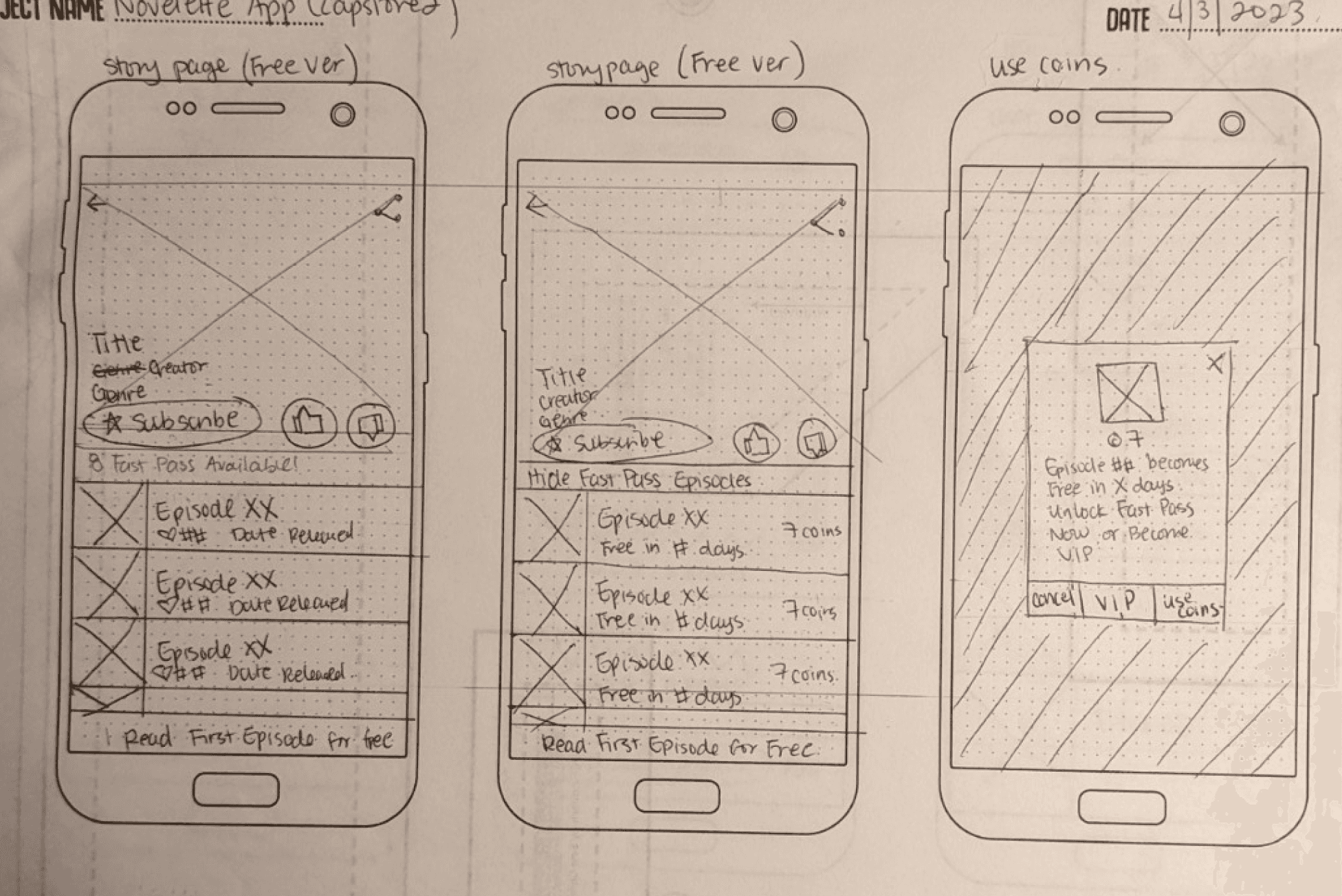
Concepts, Sketching, Wireframes
With the MVP set, I went straight to designing. The sketches allowed me to visualize and organize the designs I had been thinking of. I digitized the sketches into low-fidelity (LoFi) wireframes. I created a quick prototype and conducted usability testing with 5 users with some experience with comic reading apps.
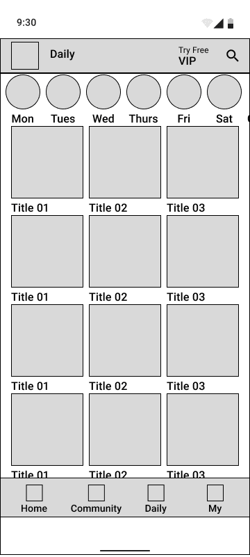
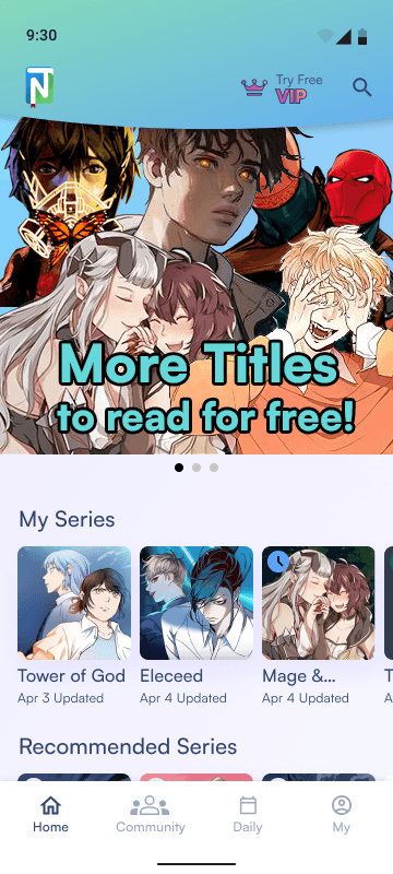
The overall results were very positive with only a few comments about the design. Users were very curious about what the Community tab and Daily tab were. I had not prototyped these screens because in LoFi they look very similar to the Homescreen tab and also serve the same function. I used the feedback from the LoFi usability testing and integrated them into the next iteration of wireframes.
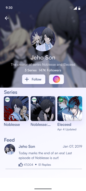
Homescreen

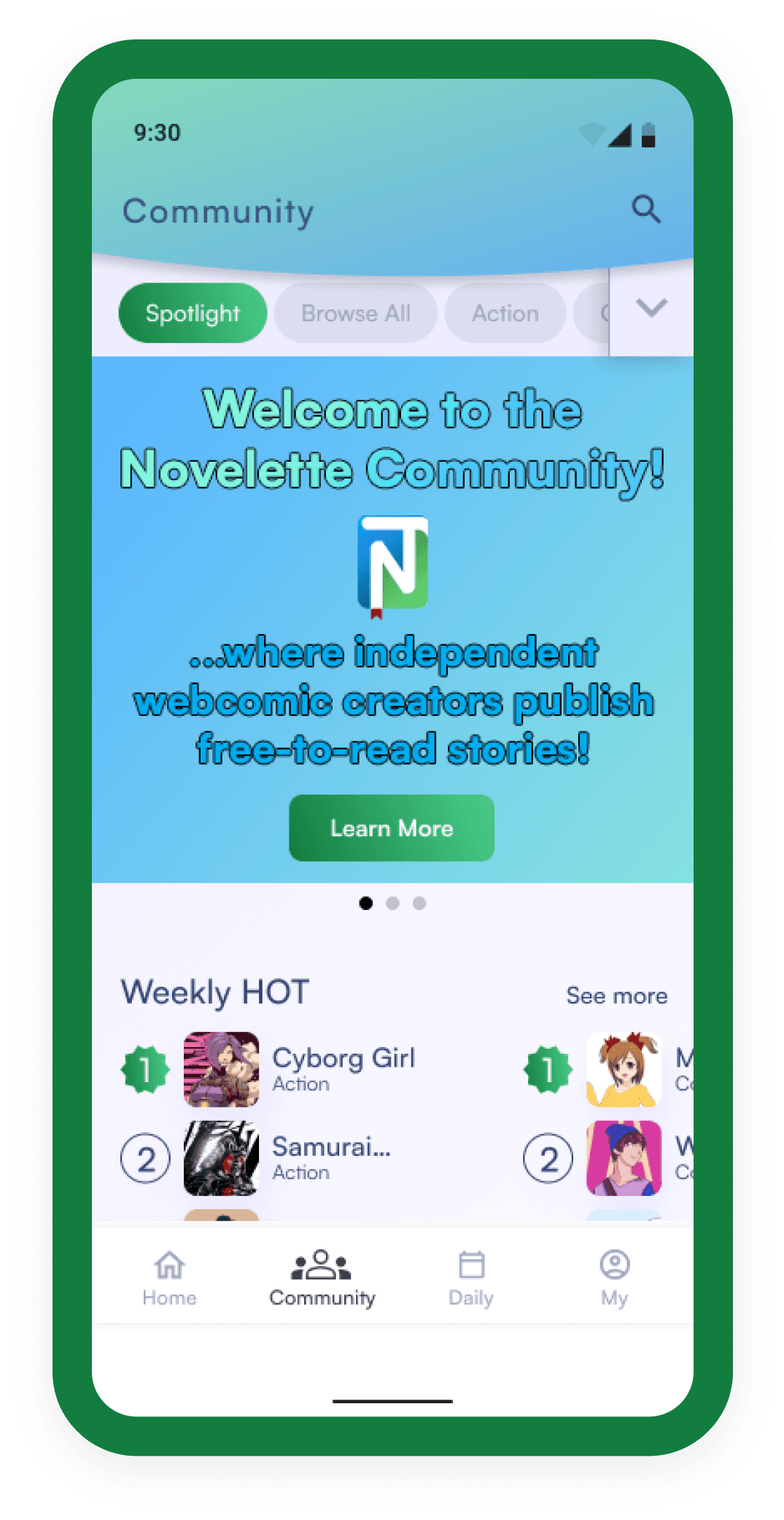
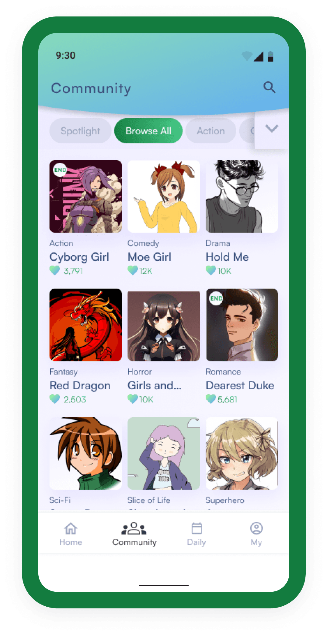
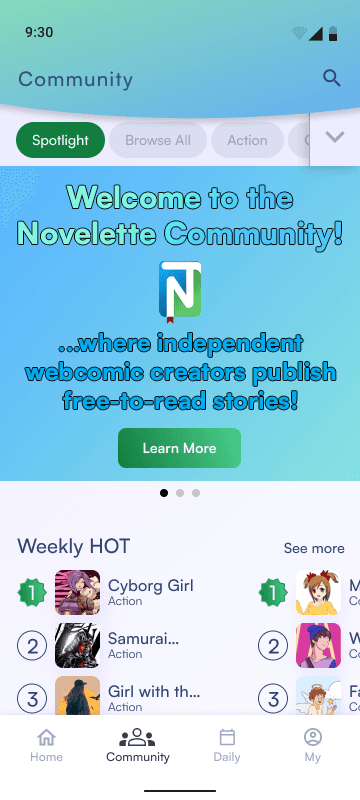
Community

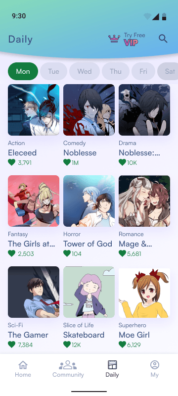
Daily
Visual Design & Prototype
I wanted to use colors that were synonymous with webtoons, so I went with a green to blue gradient. The green is a similar green to the well-known Webtoon app and the blue is the Korean webtoon/webnovel app Ridi. I decided to modify the Book App UI kit by Madalin Duca. The UI elements are pulled from Material 3 Design System (M3) for android devices. Other UI elements were designed to compliment the M3 Design System.
#137C3F
#FFFFFF
#1E9EFF
#137C3F - #4ACF8C
#EDECFF - #FFFFFF
#A1FF8B - #5DA4FF
#334471
#9CA7BD
#E4E5F2
#F9F8FF
#941800
Aa
Satoshi
Heading 4


Test: Validation, Usability, Feedback
I took my newly designed app into the real world for usability testing to see if my design addressed the users’ needs I learned from the research phase.
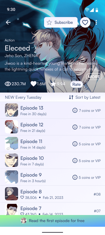
I conducted usability testing with 5 users, all who had some experience with using eBook readers or comic reading apps. These users were asked to gauge the ease-of-use of the app. I tested this by asking the users to complete the task of reading a webtoon episode and also the task of signing up for the VIP Membership.
All users were confused by the Community tab. Users were expecting a Reddit-like community forum on the Community tab screen instead of a space for community artists to showcase their work. I took various feedback from users about what this space should look like and performed a quick A/B test to see which Community tab screen users liked.
Overall, all users really enjoyed going through app and commented how they liked the look and feel of the UI. One user said, “It feels like an official webtoon reading app.”

Challenges
Learnings
Prototyping was challenging for this project. I took some extra time to properly learn certain prototyping interactions, particularly the different scrolling states of elements (fixed, sticky, scrolling).
Designing the Community tab was challenging because usability testing showed that the initial design was not working. I relied heavily on user feedback in combination with competitive analysis to design a better Community tab screen.
Conclusion & Next Steps
I learned how valuable user input and feedback are to designing a workable solution, i.e. the Community tab.
Many users during testing gave excellent feedback! It was difficult trying to pick and choose the ones I was able to iterate in the timeframe I had left. There are 2 suggestions that I would definitely like to implement in the future - (1) A Discover tab to clean up the busy homescreen and (2) a choice between swiping left/right and scrolling for the webtoon episode navigation.