Career Start
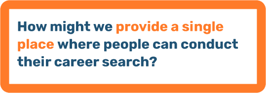
The Problem Statement
Solution Overview - Main Features
Research & Analysis
The goal for this project was to improve the career search experience. To get a better idea of what this looks like, I conducted secondary research to gain a better understanding of what career planning looks like in schools. To further confirm concretely my research findings, I conducted user interviews and competitive research.
Goals
From the user interviews, the biggest pain point seems to be the lack of information. Here are some goals I had for this project:
Provide a space where accurate and current information on careers is available.
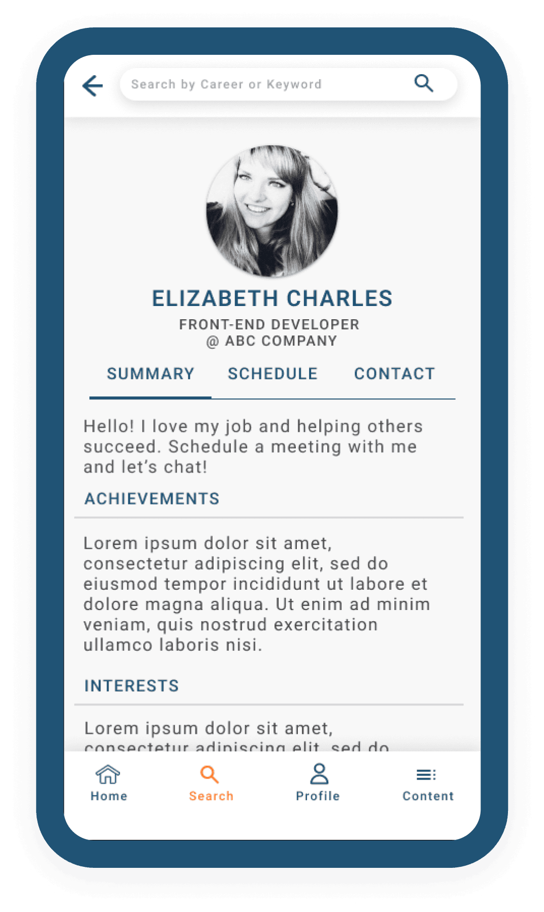
Provide an opportunity to connect with working professionals.
User Persona
To start answering the How Might We question, I identified 3 different user types - the student, the working professional, and the mentor.
I chose to use personas because it provided concrete and tangible experiences that allowed me to better empathize with the different needs of the various users.


User Flow
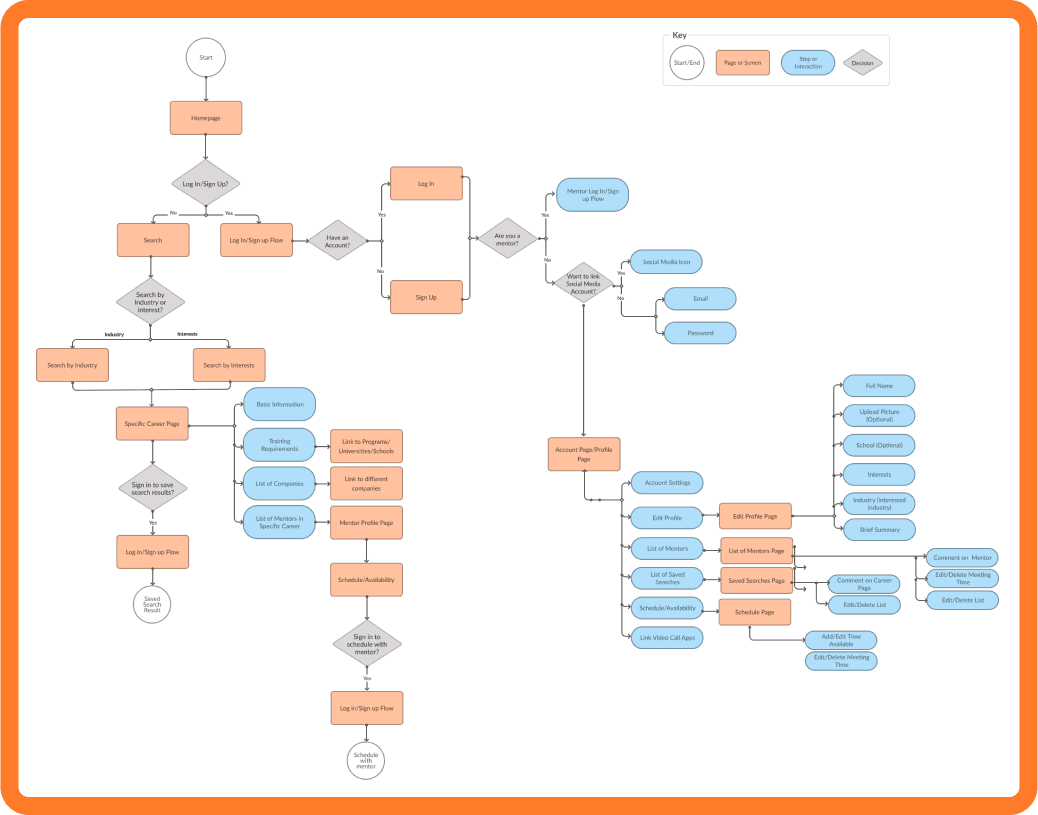
Once the users were defined, I started thinking about the user’s journey through the app. Designing user red routes helped to define which features were absolutely necessary, which helped to narrow down the minimum viable product (MVP).
Concepts, Sketching, Wireframes
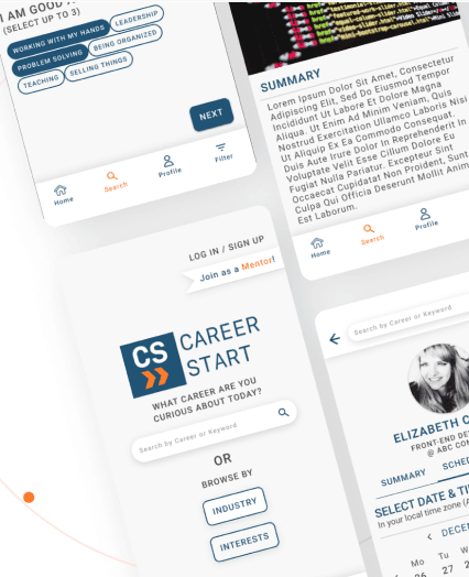
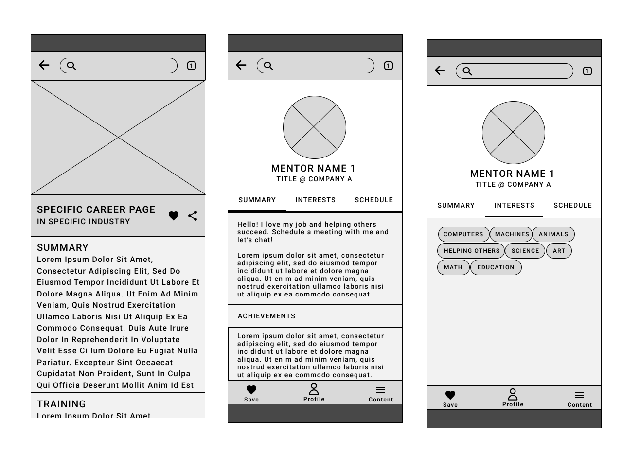
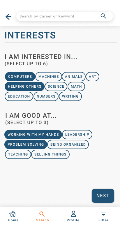
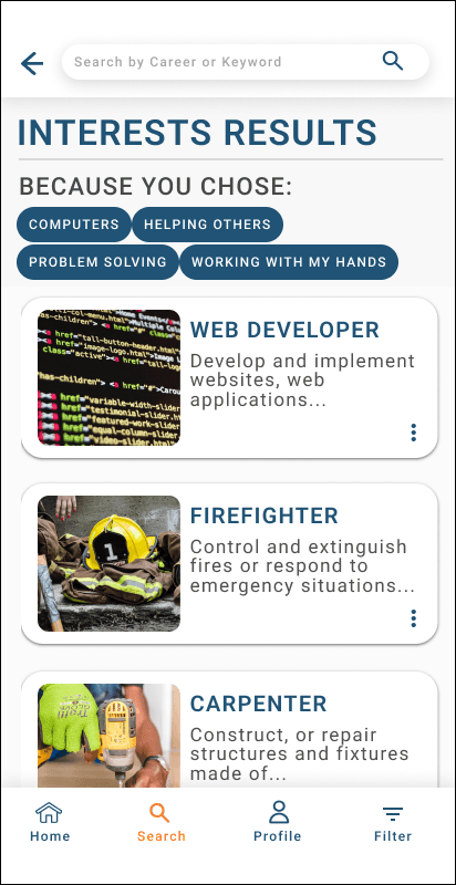
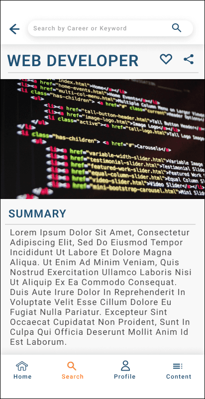
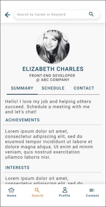
After the basic user red routes were established, I started out with sketches for a basic idea of how the pages would look. Sketching helped visualize and solidify what the app could end up becoming. I confirmed the ease of the design with guerilla usability testing. I took the feedback from the testing and integrated them into the low fidelity wireframes I created using Figma. I continued to use Figma to iterate the designs.
Visual Design & Prototype
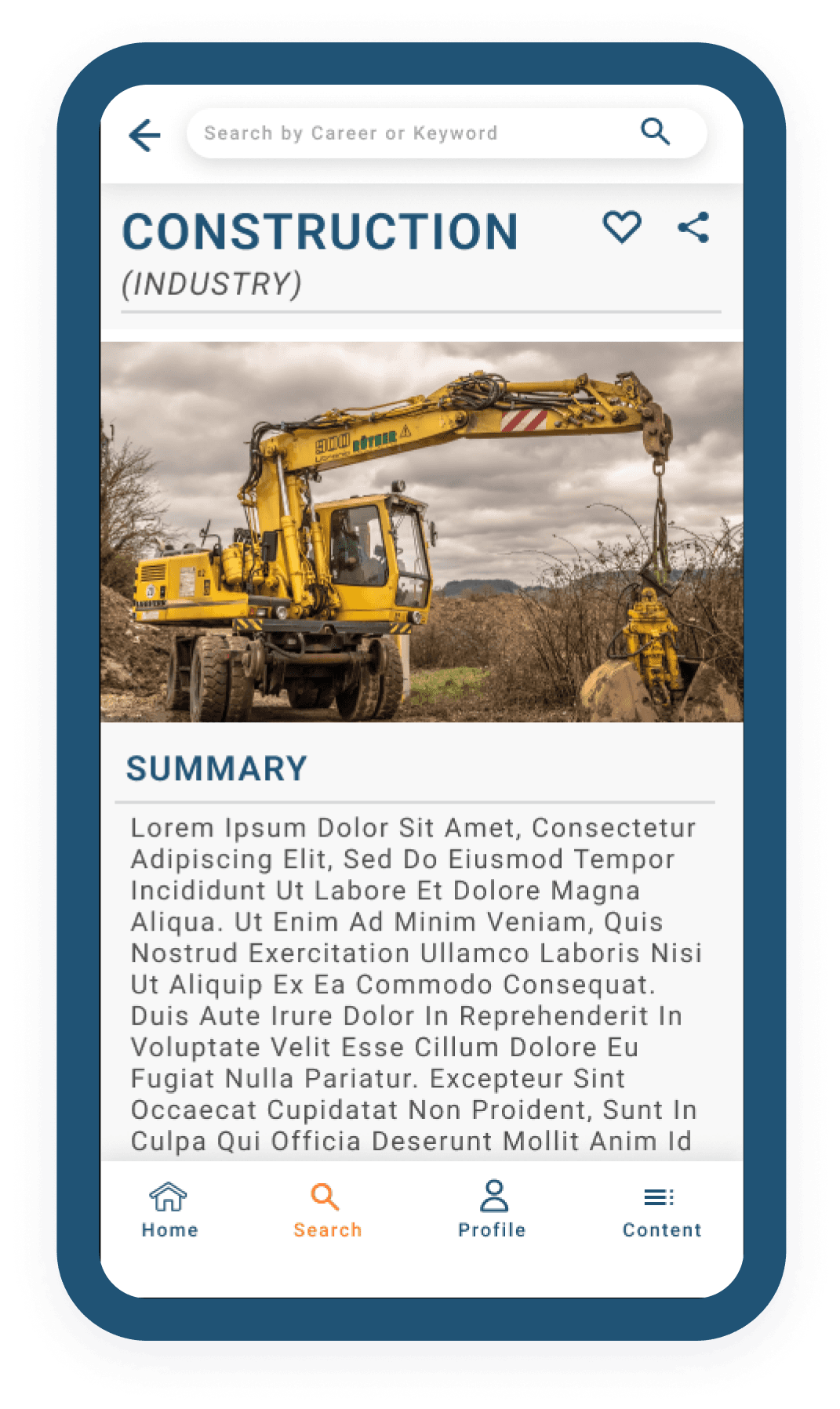
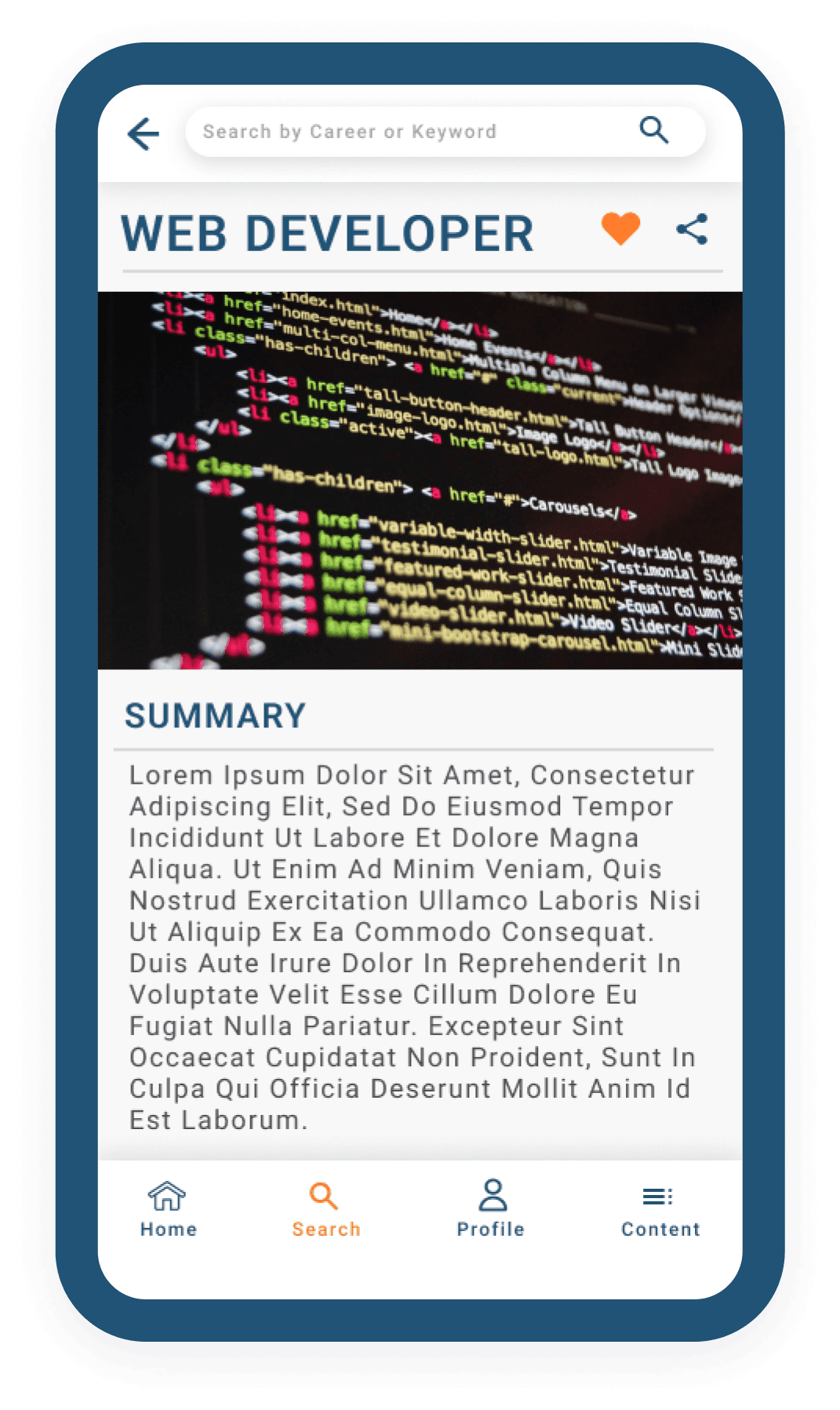
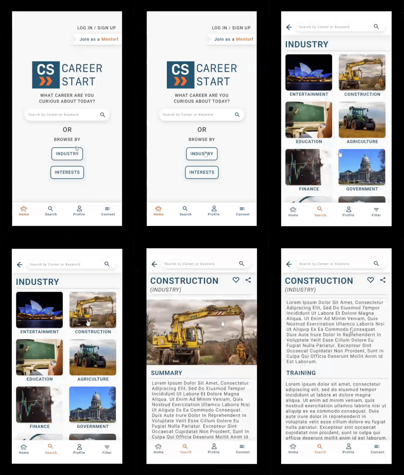
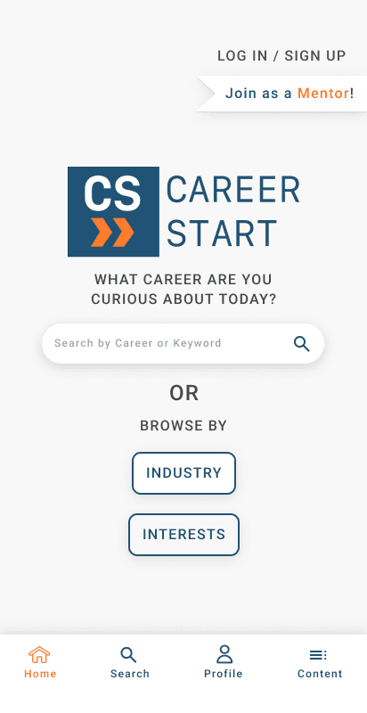
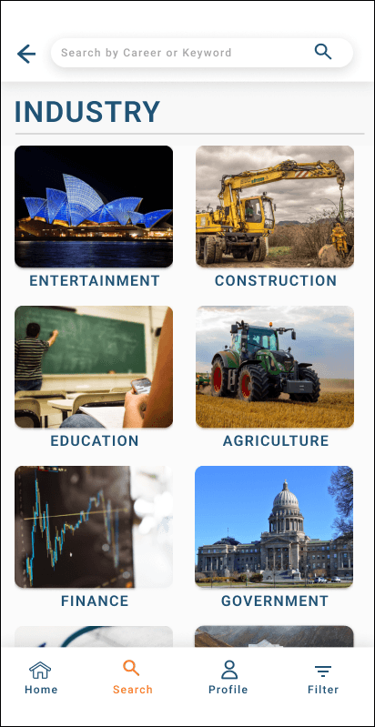
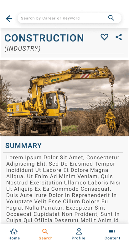
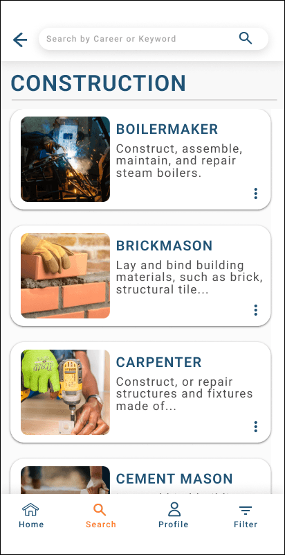
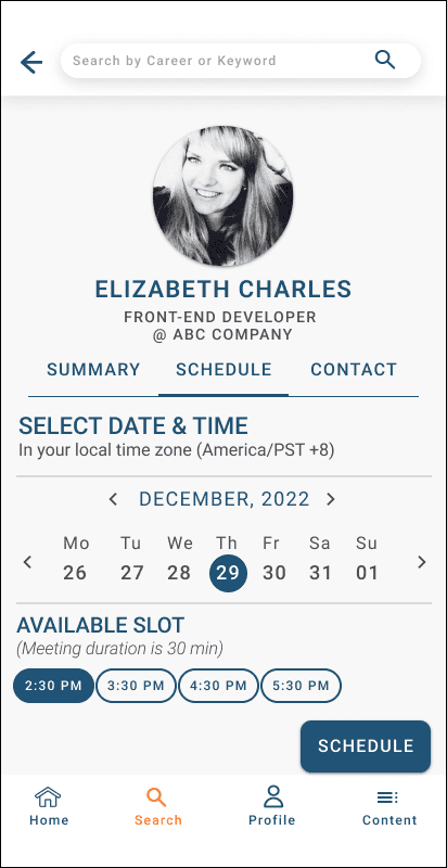
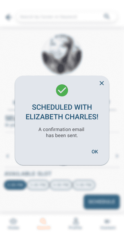
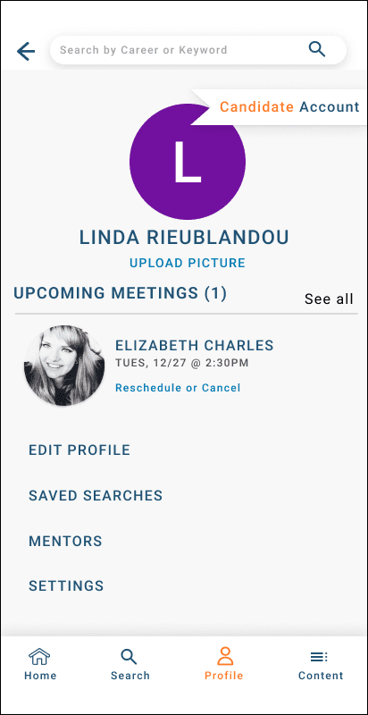
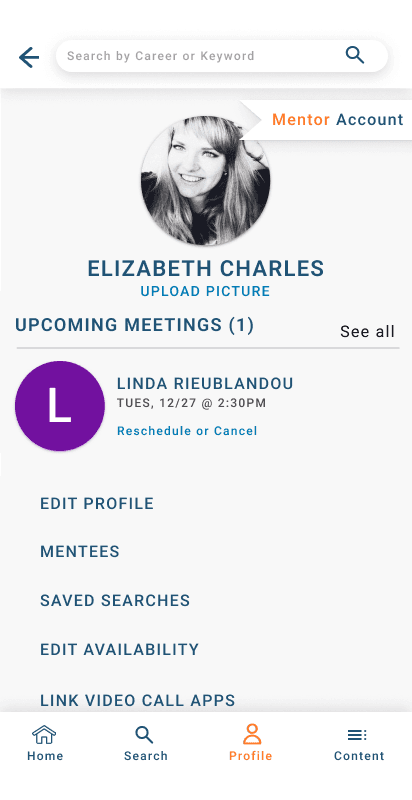
While I was sketching, I thought about what kind of visual design looks and feels like success. I chose dark blue and orange as my main colors because it reminded me of contrasting collegiate colors. The UI elements are pulled from Material 3 Design System (M3) for android devices. Other UI elements were designed to compliment the M3 Design System.
#205375
#FFFFFF
#FF7A29
#000000
#484848
#D9D9D9
#F7F7F7
#4CAF50
#E54335
Aa
Heading 3
Test: Validation, Usability, Feedback
Learnings
← Previous Project
