The Problem Statement
Solution Overview - Main Features
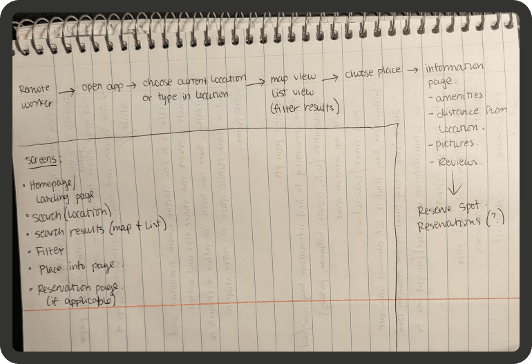
Day 1 - Understand/Map
The biggest pain points users are experiencing are how time consuming it is to find the information they need, and how the information they end up finding is often inaccurate.
The important features of the ideal public workplace have the following - good WiFi, quiet workspace, power outlets, bathrooms, not crowded, good interior space, and distance from wherever the user is located.
I drew out an end-to-end user experience map to see how I can incorporate the users’ needs into the solution. Based on the user research, having a good way to filter through locations by specific search parameters seemed to be the best way to get users what they need.
Day 2 - Sketch Your Solution
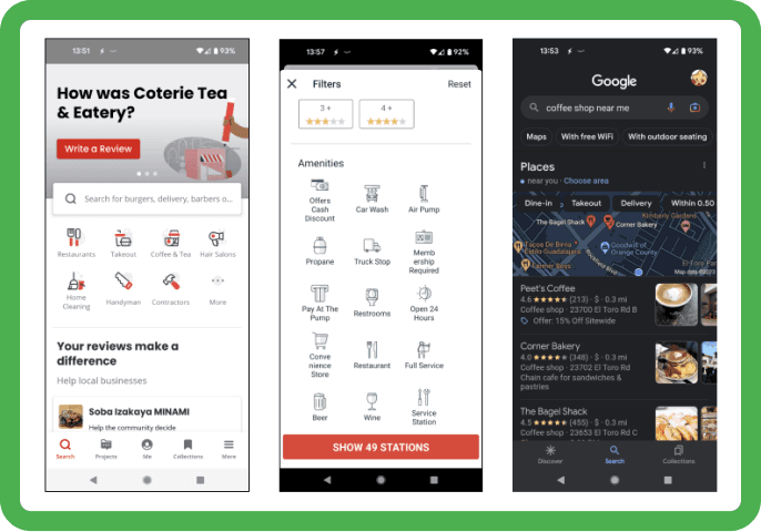
I chose to look at Yelp and Google because they are the most popular apps to use when looking for a point of interest. These apps provide a lot of places, not only restaurants and coffee shops and provide a good list of amenities to use in the search filters. I also included Gas Buddy because it is an app that provides locations of a specific point of interest as opposed to Yelp and Google.
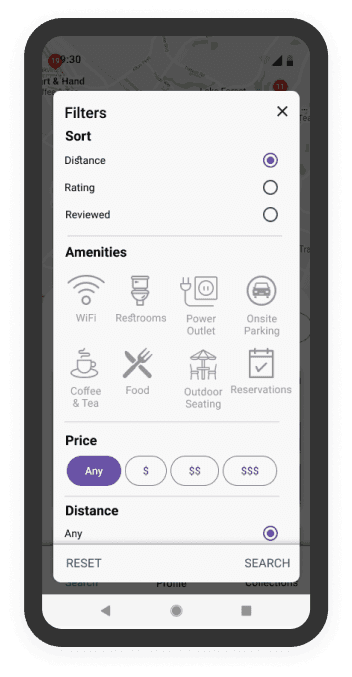
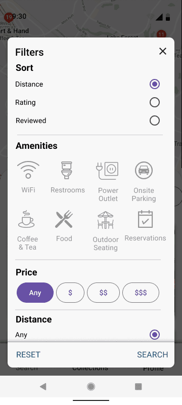
I sketched out different screens that were inspired by Yelp. Because the product’s main focus is to search for places by specific amenities, I chose the search filters screen to be the most critical screen to design.
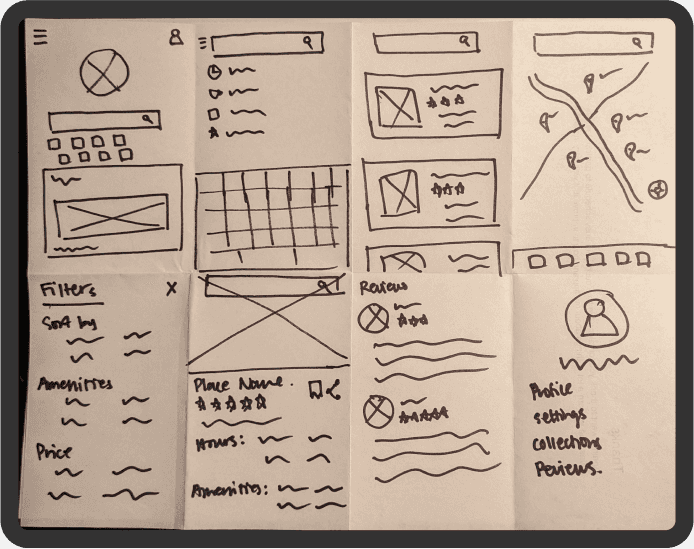
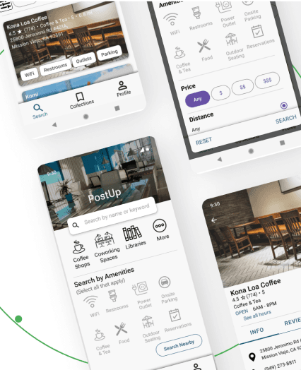
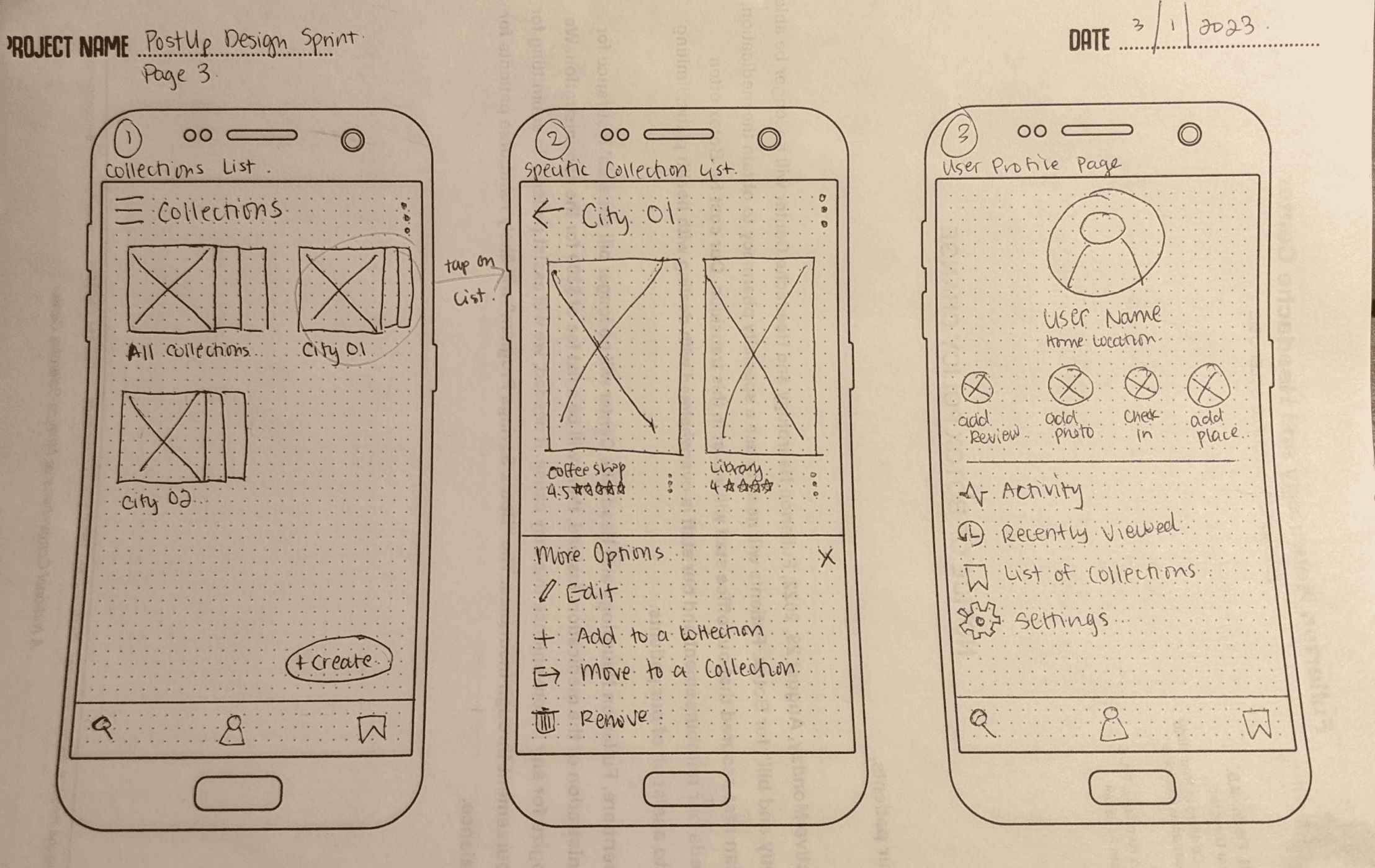
In my solution sketch, I include the search filters, the search results, and the location information page.
Day 3 - Decide and Create a Storyboard
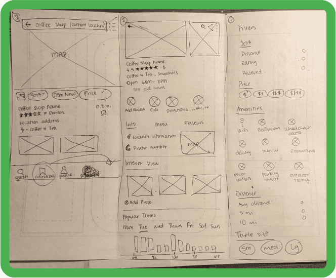
For the solution, I decided to apply Jakob’s Law (users prefer your site to work the same way as all the other sites they already know) and opted for a Yelp-like app.
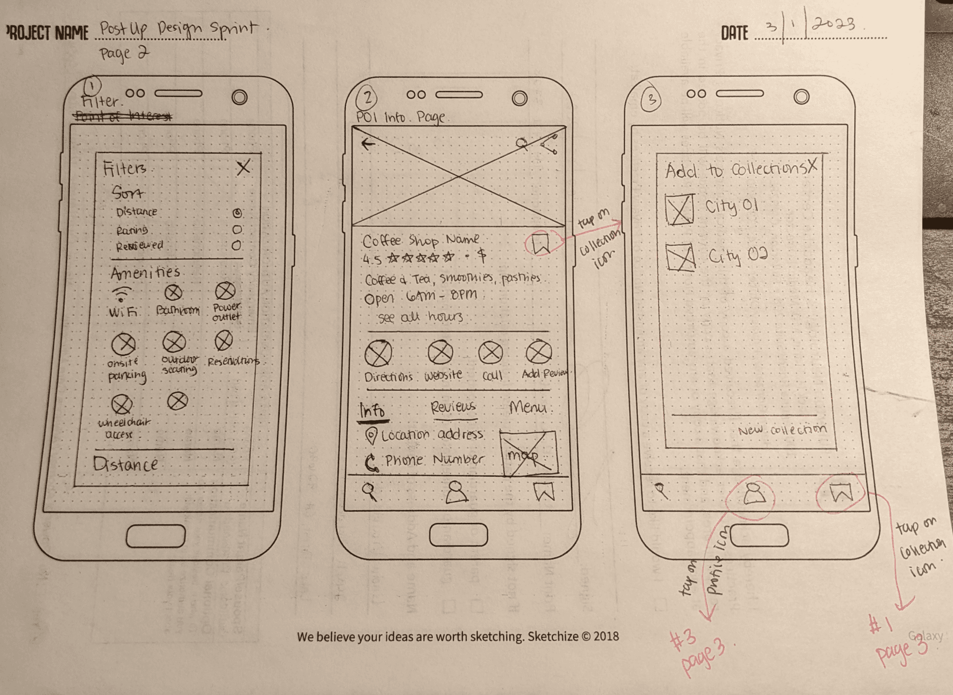
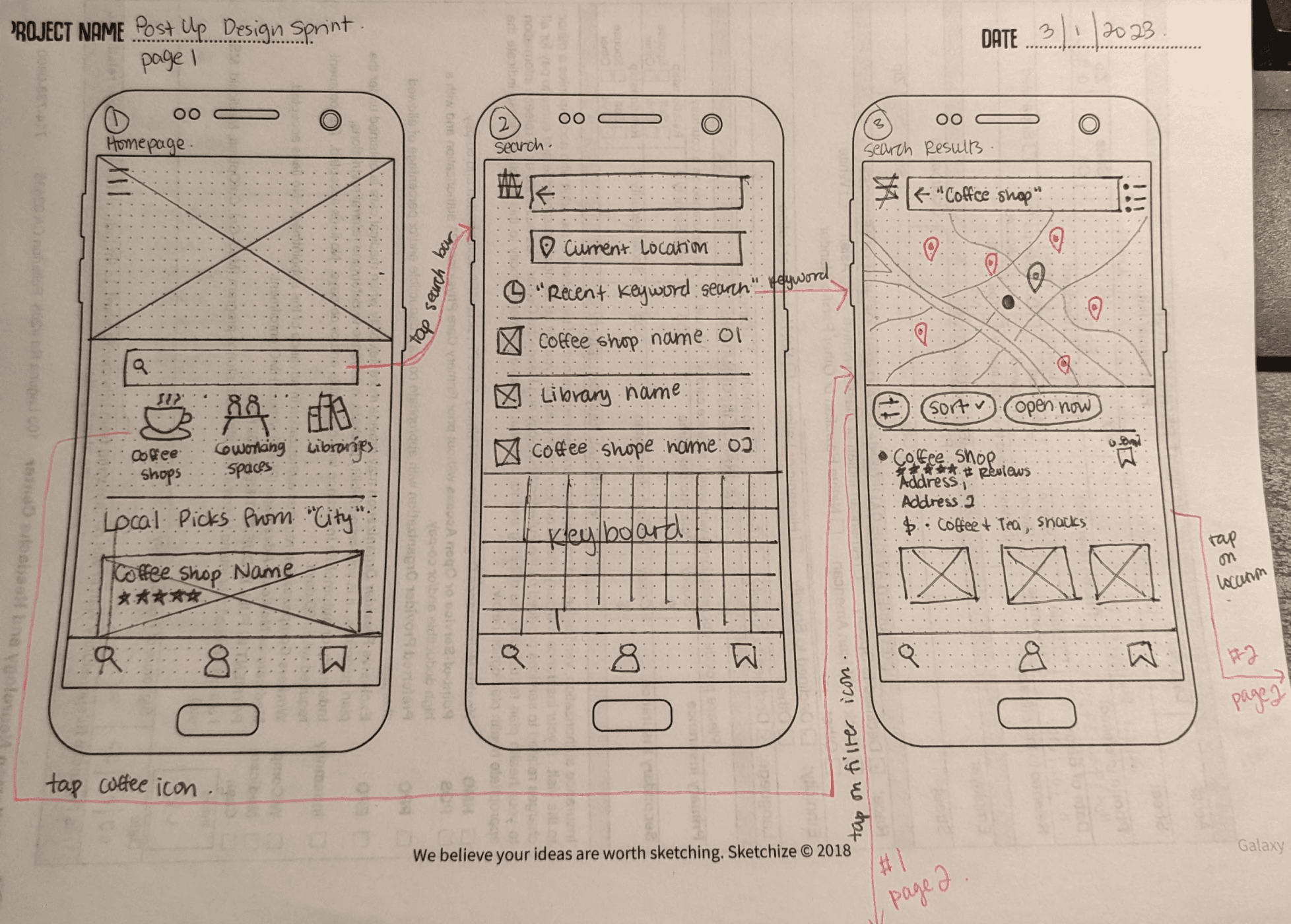
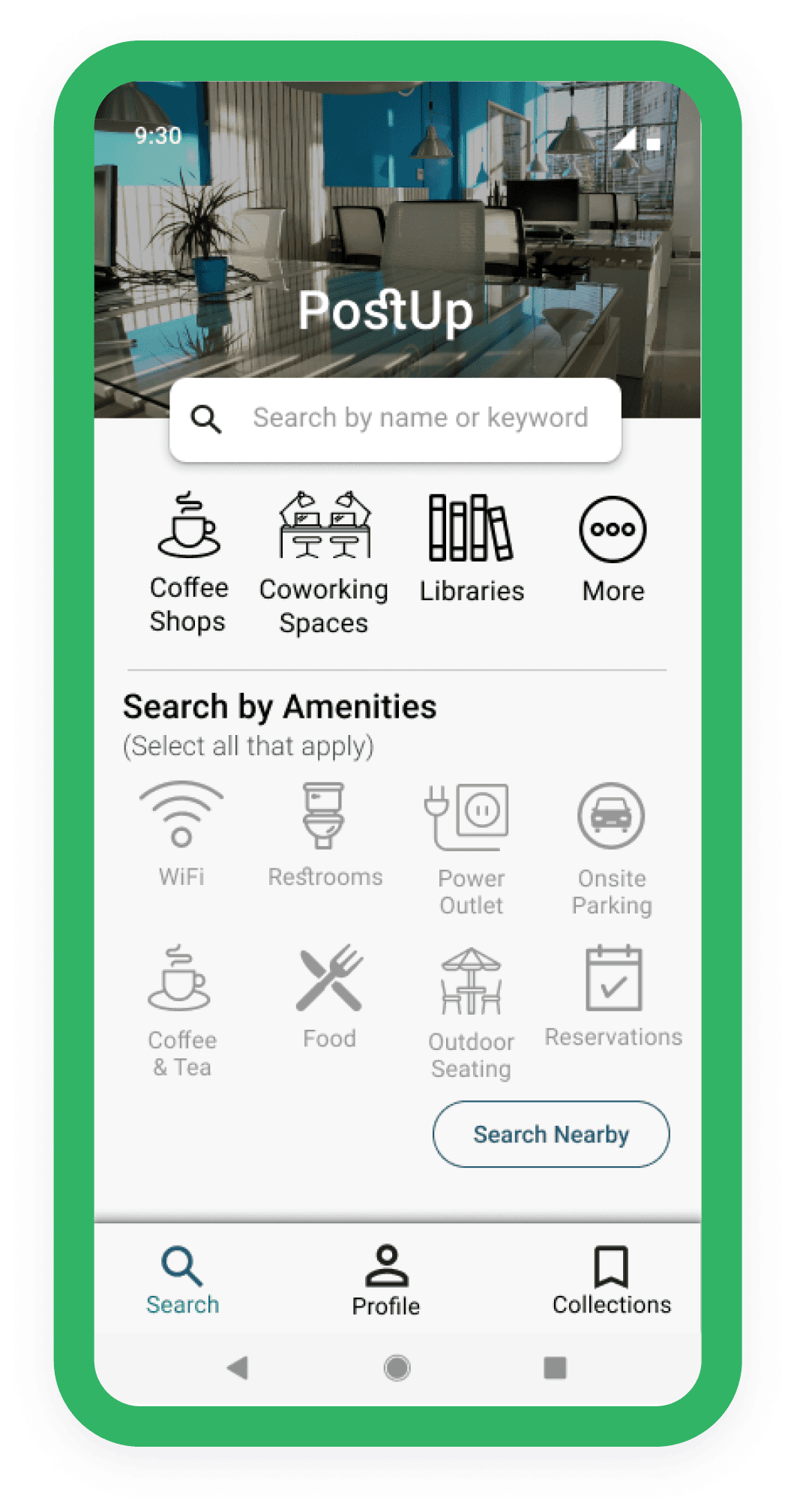
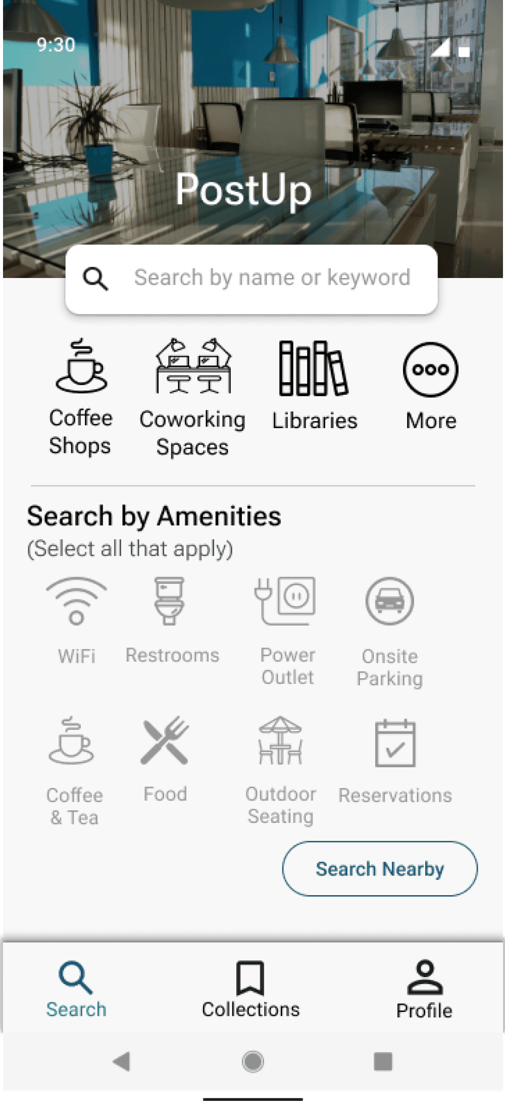
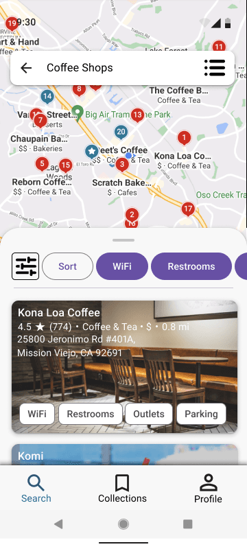
While sketching out the screens, I was trying to think of a way to make the solution distinct from Yelp. I stated before that the most critical screen for this product is the search filters, I chose to have the amenities front and center on the home screen. I tried to make the list of amenities as visible as possible, such as adding amenity chips to location cards.
Day 4 - Prototype Your Solution
The prototyping process for the design sprint proved to be a very difficult task. I was under a strict time constraint, which pushed me to prototype only the bare necessities of interactions.
The prototype shows the different user routes to searching for a coffee shop either by using the search bar or selecting desired amenities on the home screen. The main goal of this prototype is to see if searching by amenities is more favorable than the usual search via search bar. Through this testing, I hope to learn if having everything on the home screen is effective.

Day 5 - Validate
I prepared my prototype for usability testing to see if my design choices addressed the users’ needs that were earlier defined in the research.
I interviewed 5 users, all who work remotely. All users have worked in different locations outside of their home office, and have used Yelp and Google Maps to look for public workspaces.
I conducted 4 of the tests remotely and 1 in-person. In each test, I asked users to look for a coffee shop with good WiFi. All users were able to complete the task without issue and commented on how intuitive the app is. They like having the amenities on the home screen, but still gravitated towards the search bar and location icons out of habit for using apps like Yelp.
All 5 users said, “It looks like Yelp. I like it!”
4 out of 5 users said they would pay a small subscription fee to use this app if the app had accurate information on the important amenities.
Learnings